At this point a supplement to the Accordion. In this example, we will continue with the options already defined in the last article "Accordion with Images". Now we adjust the items layout a little bit.
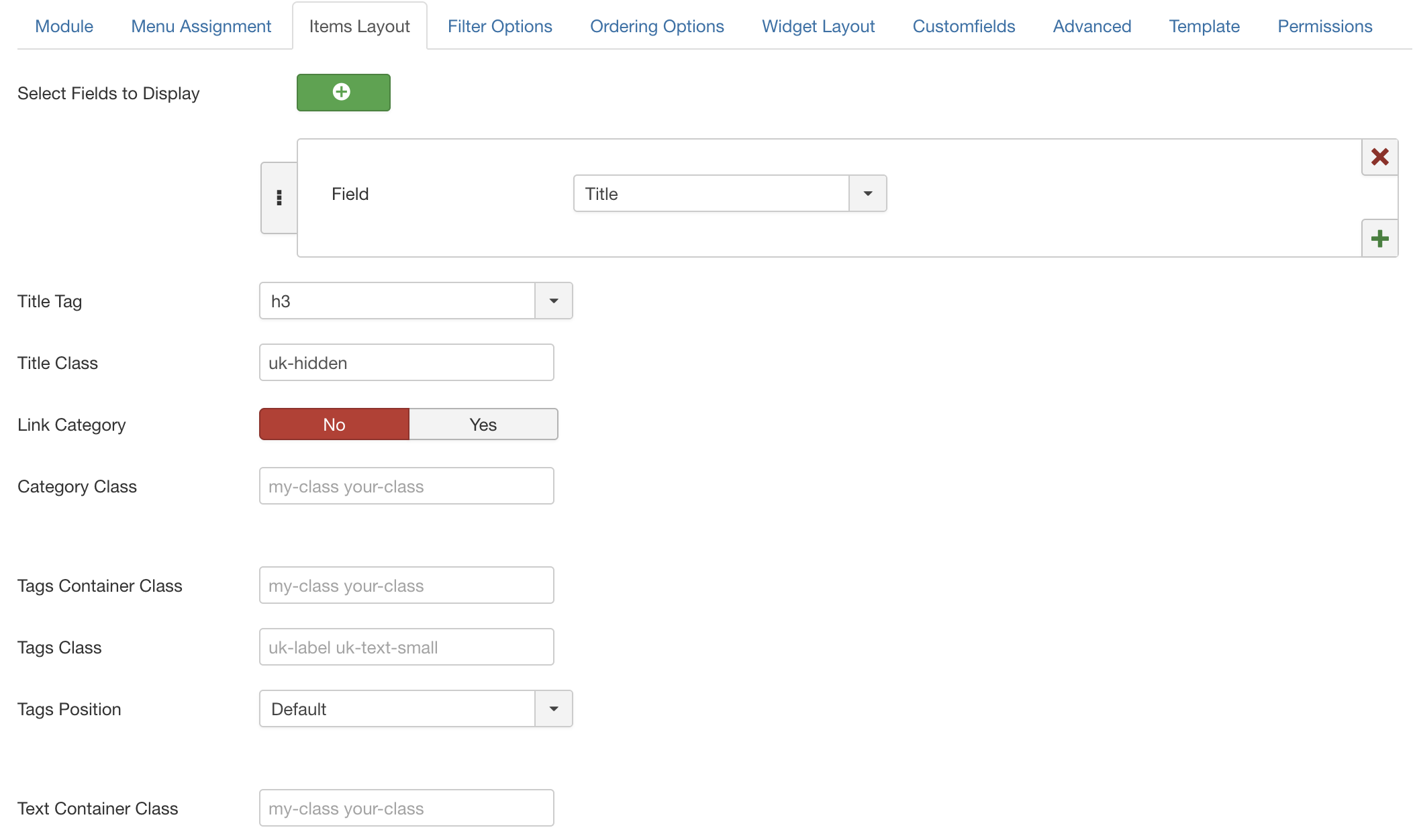
For this we open the module settings and switch to the tab "Items Layout". Let's look at the options in detail:
| Option | Description |
|---|---|
| Fields to Display | Here you can choose which fields should be displayed within the item, for the Accordion within the content area. At least one "special" field must be selected. By default this is the Title. If you don't want to show additional fields you can choose the title as type and enter the class "uk-hidden" as class name which hides the title in the frontend. |
| Title Tag |
Refers to the Title element. |
| Title Class | Custom CSS class names applied to the title. |
| Link Category | Should the categories be linked when they are displayed? |
| Category Class | Custom CSS class names applied to the category elements. |
| Tags Container Class | Custom CSS class names applied to the tags container element. |
| Tags Class | Custom CSS class names applied to the tag elements. |
| Tags Position | Define where the Tags should been placed |
| Text Container Class | Custom CSS class names applied to the text element container. |
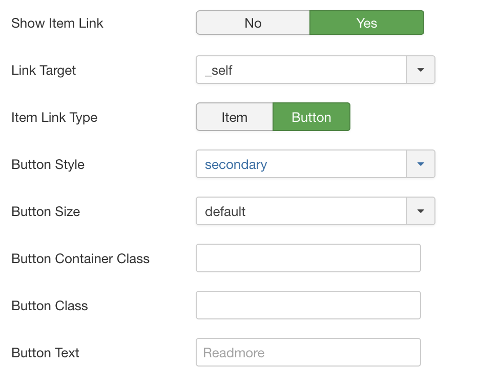
| Show Item Link | Defines if we show an article link on the respective element, you can choose if the whole element should be linked or a button should be shown. |
In our example we activate the option "Show Item Link" and select the option that a button with a link to the item should be used:
The options shown above lead to the following representation with our "Hotel Examples":

By the way, with the CSS class names "uk-flex uk-flex-right" you can also display the Readmore button right-aligned just add it as Button Container Class.