The WidgetsBox for Joomla! allows you to present your articles as slideshow, grid, list, slider or accordion on your page. After installing the module, we now create a new instance of the WidgetsBox module and present our articles on a separate page.
Demands
In order to follow the steps in this tutorial, the following requirements must be met:
- You must have already created some articles
- said articles must be assigned to the same category (or child category)
- Alternatively: the desired articles must be tagged with an identical TAG
- The articles must be published (status published) and the current user must have access to these articles (ACL)
Optional:
- The articles must have an intro image defined
After we have created a new instance of the WidgetsBox via Extensions > Modules using the New button (top left), we can already get started with the configuration.
Configuration
Note: Under Joomla 3.x the module settings are unfortunately not as nicely arranged as under Joomla 4. In the sequel we will work here with the "more complicated" Joomla 3 screenshots.
In the Module tab we find the basic settings for the sources. First we find the widget selection, here you can basically define which widget should be displayed by the module. The options for title, image & intro text behave as expected and define the source of the corresponding content. A word about the fallback image. This is always used if the selected field in an article is empty. If no fallback image was selected, the module sets its own fallback image.
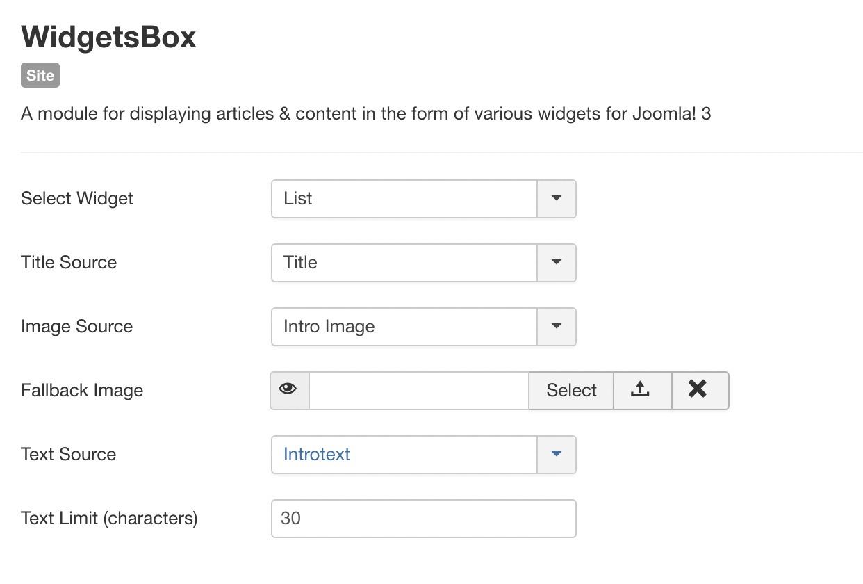
We will now build a grid layout, so let's select Grid as the widget. If your article images are stored in the field Intro Image you can use this otherwise you can of course choose Full Text Image as Image Source.
Menu Assignement
To keep everything simple we choose "On All Pages" at this point. But if you know what you are doing, fell free to load the module only on the pages you have already defined.
Items Layout
In the Items Layout section we define the structure / appearance of the respective item within the grid (or slideshow or list...). The first option on this page is also the most important. Here you define which fields should be displayed effectively and in which order. By default the title is already set here, but you can also display other elements like Category, Tags, Created, Created by and Publish Up.
With the options listed below you can customize the behavior as well as the appearance of each element.
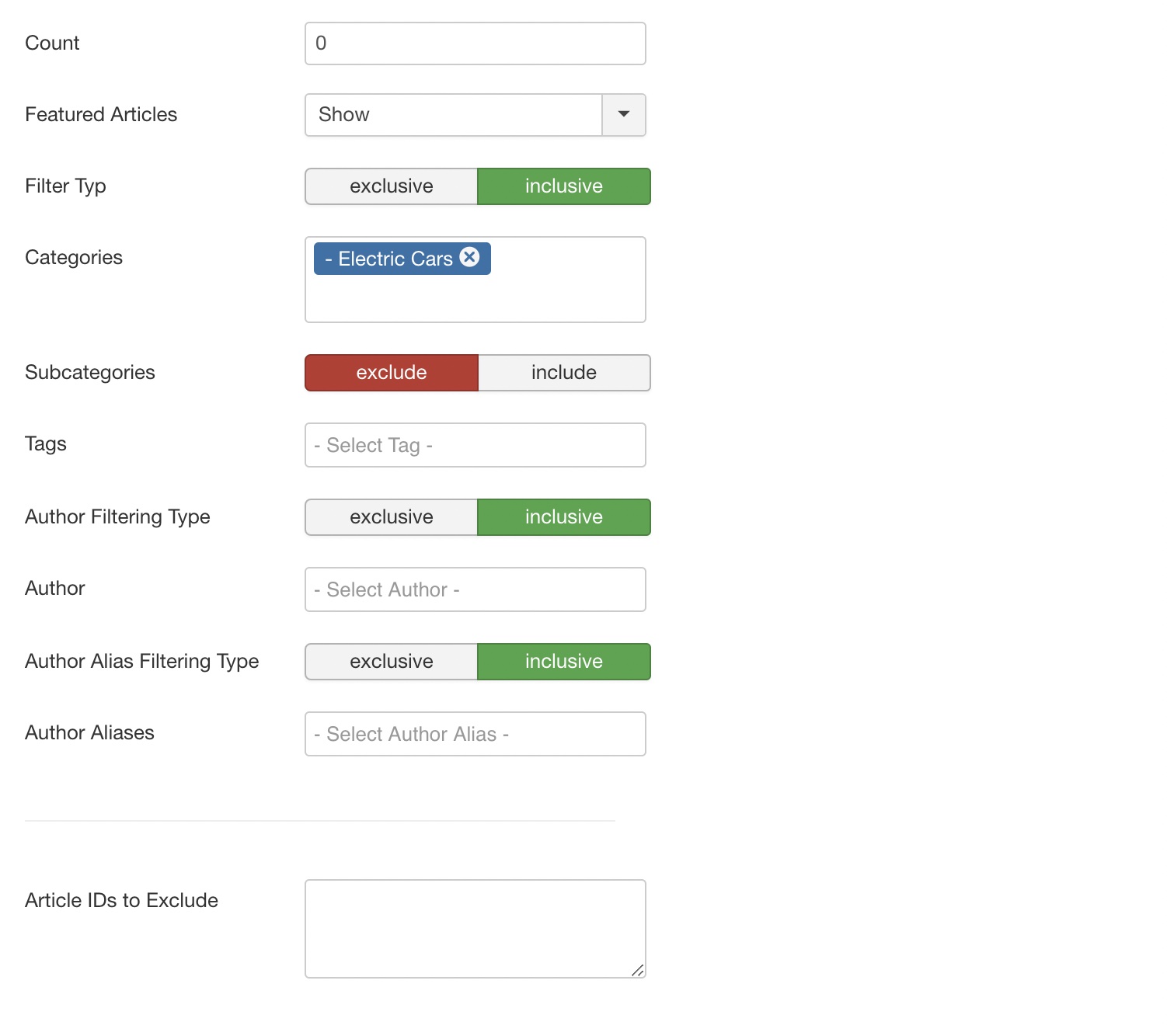
Filter Options
The filter options are versatile and essentially correspond to the Joomla! solution for Category Articles - accordingly, the interface is kept almost identical. For our small project, it is sufficient to select the appropriate category in the Categories field, in which the articles we want to display are located. Of course, articles can be included or excluded in subcategories.
Tab Widget Layout
We want to create a grid, so let's switch to the corresponding tab, each widget has its own tab under Joomla 3 whereas under Joomla 4 all layouts are united in one tab and only the corresponding field set (based on your widget choice) is displayed. However, the fields are identical.
Columns
First we take care of the columns. The main setting (without @ specification) defines the basic configuration for small devices, resp. smartphones in portrait mode, here I recommend to use always 1, i.e. that the contents are displayed in one column below the other. The configuration @s defines devices with small viewport in landscape mode - usually smartphones in landscape mode or tablets in portrait mode. The option @m then applies to tablets in landscape mode or small desktops. The option @l then applies to all larger devices. Depending on content and gap I usually recommend 1, 2@s, 3-4@m, 5-6@l . But best you play with the settings yourself and change the size of the browser window on your computer to see the effect.
The Grid size option defines the distance between the individual elements, the grid-gap. The Grid Match option displays uniform sizes within a row. Smaller cards, with less text, for example, will be sized to the size of the other elements.
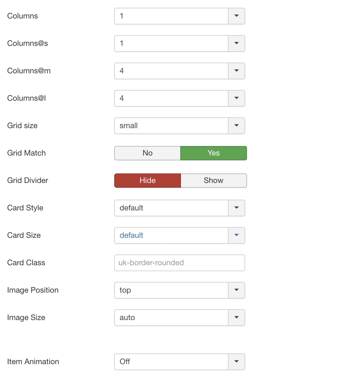
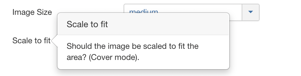
There are many more options as you can see, it's best to hover your mouse cursor over the corresponding title if you want to learn more. One thing I would like to mention is the Image Size option. If this is set to Auto, the image will be included in the given original ratio, but if not all images have the same aspect ratio, this can quickly lead to unsightly grids. With this option you can fix the height of the image container and additionally make the image fill the whole area (cover mode) so you get a uniform grid in which all images have the identical height. Use the Scale to fit option that appears when you select a height like small, medium or large:
Now the basic setup is done and the module can be published. Make sure that you set the module to published in the right column of the tab Module and that the access is given according to ACL (Access).
If you now add the module to an article of your choice, it will look like this: