As you probably already know, Oriel can not only display your images, but also create complete album overviews at the touch of a button.
This article deals with what needs to be done to get such an overview like in this live example:
https://demo.nx-designs.com/index.php/orielpro/album-layout/orielpro-album-demo-2
In the example shown above, the folders of the first level are automatically defined as albums.
Attention: Only folders with at least one image file are indexed - the cover.* file will be ignored.
The folder structure
Oriel uses your folder structure to create galleries - so it's important that you think about how you want your gallery to look when you create your folder structure.
The folders of the first level are defined as albums in the album overview. If there is an image within this folder with the file name: cover.jpg, cover.png, cover.gif it will be used as album cover. You don't have to worry, the cover image will not be shown in the album overview later. So if you want to define an explicit photo as cover, just copy it and save it as cover.jpg/png/gif with the other images.
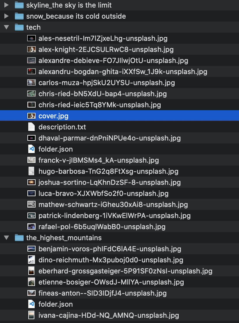
Example
In the image to the left you can see how a gallery folder is built up that is used with Oriel. The additional files like cover or description are stored with the images.
Oriel Parameters
Let us now move on to the basic settings in Oriel that were made for the example shown above:
First select in Base(Module) Tab, Albums as Oriel Mode. Various new additional options will then appear:
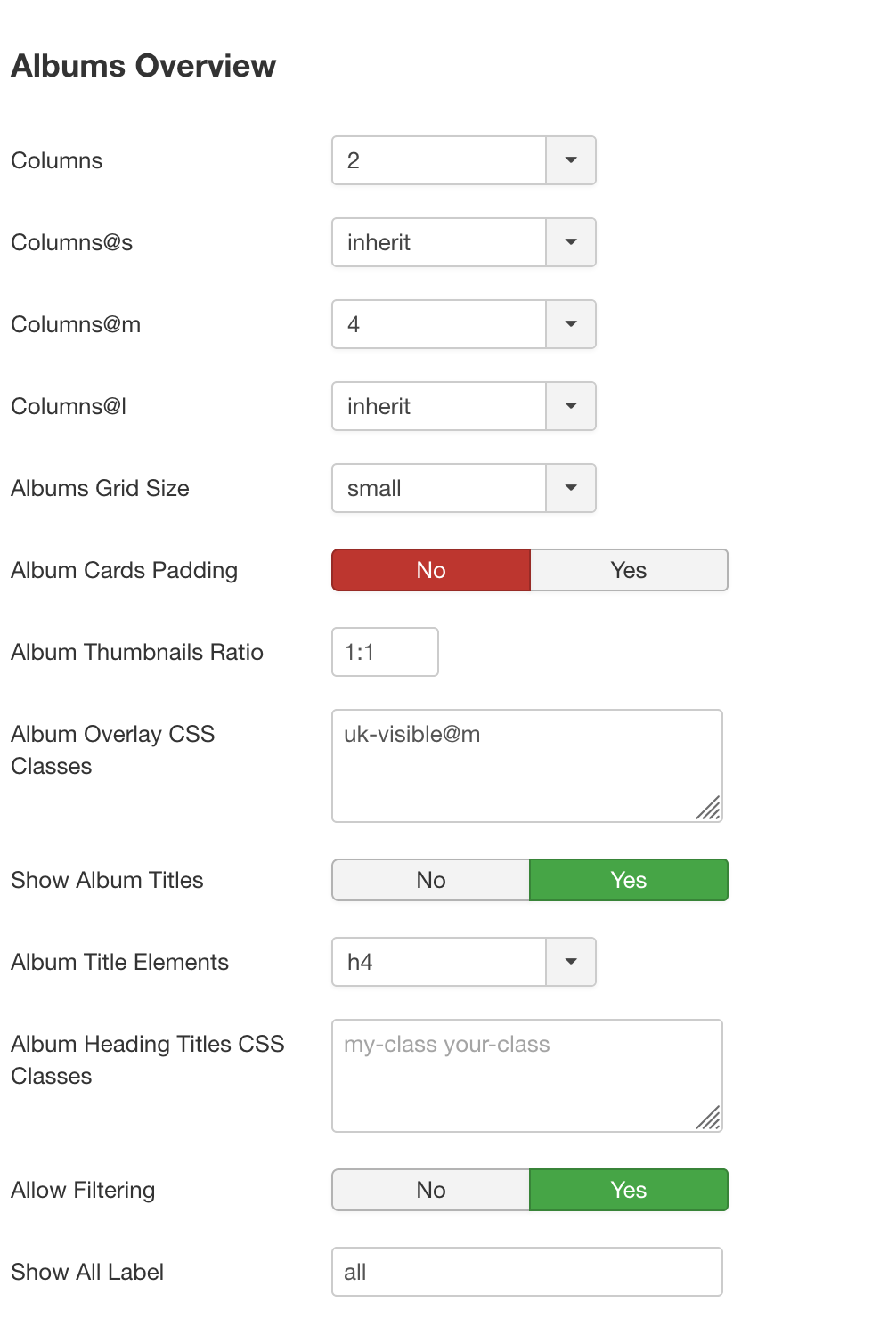
Most of these options should be self-explanatory. However, I would like to mention the Allow Filtering option, when this option is activated folders within an album (i.e. folders in level 2) are used as filters within the album.
As soon as we use the Oriel Mode Albums we will find more additional options in the Album View tab. These fields allow you to define, for example, whether a head area should be displayed within the album. You will also find a separate area for editing the image grid: Columns for the different display sizes & size of the grid spacing.
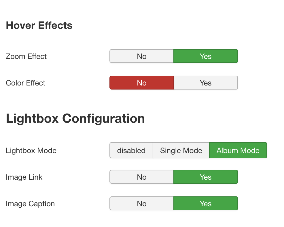
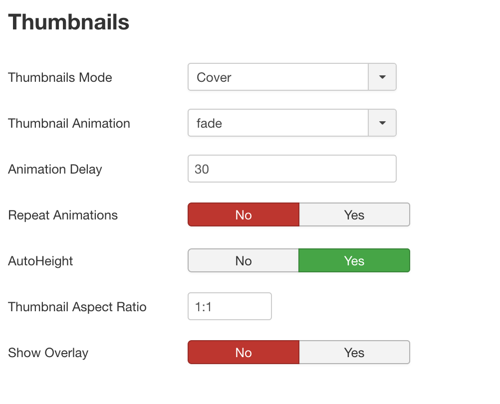
In the Tab Thumbnails & Lightbox we can now define the individual parameters for the thumbnails. Our example uses the Thumbnails Mode Cover with active AutoHeight option and an aspect ratio of 1:1.
Finally, here are the additional / optional layout options: